Brand Guidelines

Brand
Guidelines

Everything you need to present Oliver Hume consistently, clearly and confidently.

Download brand assets
Version 2.5 · Updated May 2026

Introduction

This document is designed for the teams and partners involved in building marketing, communications, and product experiences for Oliver Hume.

Our goal is to ensure consistency, simplicity, and clarity across every touchpoint of the brand. These guidelines serve as a foundation for expressing who we are - visually and verbally - so that no matter where or how our brand appears, it remains recognisable, trusted, and aligned with our values.

As Oliver Hume continues to grow and evolve, so too will this document. These guidelines are a living resource that will be updated as our strategy, identity, and creative expressions develop. We encourage you to use this guide with care and creativity and reach out to the Marketing team if you ever need further support.

Contents

  1. 1.0Oliver Hume BrandStrategy, vision, purpose, values
  2. 2.0Logo and SymbolLockups, clear space, sizes, usage
  3. 3.0TypographyTypefaces, hierarchy, alignment
  4. 4.0Colour SystemPalette, shades, accessibility
  5. 4.0Data VisualisationChart colours and styling
  6. 5.0Shape and PatternShapes, modules, tile, bento
  7. 6.0ImageryStyle, brief, examples
  8. 7.0ApplicationWebsite, social, print and more
  9. 8.0UI ComponentsProposed · navigation, buttons, cards, forms, grid
  10. 9.0Property Data VisualisationProposed · market report charts and tables

01

Oliver Hume Brand

Our brand strategy is the blueprint for our business and our future success. It outlines who we are, how our customers view us and how we are different from all the other real estate companies out there.

Brand idea

Brand idea

Partner with the experts

Restless achievers

The brand idea centers around us as a company, and as individuals – as restless achievers who are constantly striving for success.

Although we may not make reference to these words directly in our communications, these words should influence the tone of all communications, both visually and through language.

When developing new communications for the brand, it’s helpful to refer back to this as often as you need to ensure that the Oliver Hume brand remains strong and consistent.

Vision and purpose

Brand vision

Our vision is to be Australia’s leading integrated proptech group.

Brand purpose

Our purpose is to create competitive advantage for our clients and investors through innovation, technology and doing it better.

Brand values

We innovate

We develop innovative solutions to create competitive advantages.

We seek excellence in all we do.

We lead

We lead by example.

We provide leadership to our people to ingrain a culture of excellence within our team.

We do as we say

Our relationships are honest and built on respect and loyalty.

We deliver on commitments and build enduring trusting relationships.

We are tenacious

We are relentless in pursuit of the best outcome for our clients.

Our people push themselves harder to achieve the best possible outcome at all times.

We grow continuously

Our people are committed to developing their skills so that they thrive in their careers.

We strive for knowledge, to better ourselves.

Brand positioning

  1. 01Challenging the status quo
  2. 02Partnership with clients
  3. 03Being the best informed
  4. 04Associated with profile projects
  5. 05Hungry for success
  6. 06Clarity and openness
  7. 07Hiring and retaining the best
  8. 08Imaginative ways to invest
  9. 09Single cohesive
Quick usage guide

70+ Years logo

The 70+ Years logo celebrates Oliver Hume’s long-standing presence and success in the property industry. The use of the logo is encouraged across marketing materials to reinforce this milestone.

Logo variations

Use the appropriate variation depending on the background.

Always ensure the logo is clear, easy to read, and has strong contrast against the background.

70+ Years logo, white on maroon

White on maroon background

70+ Years logo, white on black

White on black background

70+ Years logo, maroon on mist

Maroon on mist background

70+ Years logo, maroon on white

Maroon on white background

Lock up with Oliver Hume logo

Oliver Hume logo locked up with 70+ Years, Delivering Success, in white

White lock up on maroon background

Oliver Hume logo in Midnight locked up with 70+ Years, Delivering Success, in Maroon

Midnight and maroon lock up on white background

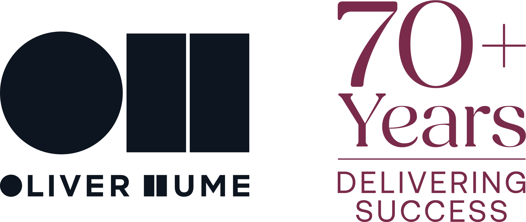
Stand alone logo, and lock up with Oliver Hume logo. In the lock up, the stacked Oliver Hume logo (symbol over the wordmark) sits on the left and the 70+ Years logo on the right. The 70+ Years logo is about 1.4 times the height of the Oliver Hume logo and the two are centred on each other, with a gap of about a third of the Oliver Hume logo’s width between them. Use the lock up artwork files rather than placing the two logos by eye. View the original page from the PDF.

Typical applications

The logo should be included in:

  • Email signatures
  • Corporate marketing collateral (brochures, flyers, banners)
  • Digital assets (EDMs, social media, website)

Placement guidelines

Placement guidelines

  • Position as a supporting brand element, not the main logo
  • Maintain clear space around the logo
  • Align with existing layout grids where possible
  • Recommended placements: top or bottom corners; within hero sections; as a badge or callout element

Clear space and minimum size

Clear space

To ensure clarity and visual impact, always maintain sufficient clear space around the 70+ Years logo. The clear space is defined using the “+” symbol:

  • Left & Right: minimum 2× the width of the “+” symbol
  • Top & Bottom: minimum 1× the width of the “+” symbol

Minimum size

Ensure the logo remains legible:

Digital
minimum 60px width
Print
minimum 20mm width

When to use the OH 70+ Years logo

When to use
  • Corporate brand communications
  • Marketing campaigns and promotions
  • Collaterals where Oliver Hume is the lead brand
When to omit
  • Small or space-limited layouts
  • Functional or transactional content
  • Collaterals where OH is not the primary brand
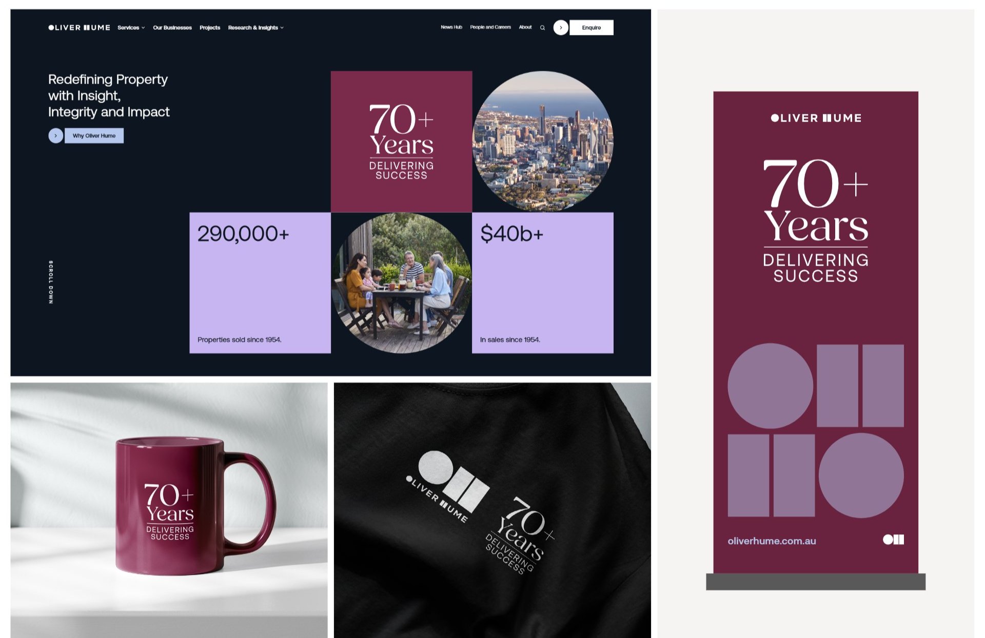
70+ Years logo on the website, a mug, apparel and a pull-up banner
03

Typography

Aeonik is a contemporary grotesque sans-serif that strikes a rare balance between precision and personality; making it an excellent fit for a brand like Oliver Hume, that spans both lifestyle and capital investment sectors.

Aeonik
Aa

Primary typeface

Visually, Aeonik conveys confidence, professionalism, and modernity, while still feeling human. It doesn’t overpower the brand; instead, it offers a refined foundation that can flex between sophisticated investment materials and approachable, first-home-buyer communications.

This makes it an ideal bridge between the master brand and its sub-brands, helping unify the Oliver Hume system without flattening our tone.

From a web performance perspective, Aeonik is optimised for screen readability, with strong geometric clarity at small sizes and excellent spacing that holds up across responsive layouts. It’s especially effective for navigation, CTAs, data tables, and longer body text.

Its generous x-height and distinct letterforms (like the open “a” and circular “g”) contribute to its legibility and make it ideal for UI design and accessibility compliance.

RegularAa Bb Cc Dd Ee Ff Gg Hh Ii Jj Kk Ll Mm Nn Oo Pp 0123456789
Regular ItalicAa Bb Cc Dd Ee Ff Gg Hh Ii Jj Kk Ll Mm Nn Oo Pp 0123456789
MediumAa Bb Cc Dd Ee Ff Gg Hh Ii Jj Kk Ll Mm Nn Oo Pp 0123456789
Medium ItalicAa Bb Cc Dd Ee Ff Gg Hh Ii Jj Kk Ll Mm Nn Oo Pp 0123456789

Alternate typeface

Arial

Arial is a widely available grotesque sans-serif that serves as a reliable system fallback for Aeonik. While more conventional in appearance, it shares Aeonik’s typographic lineage and maintains core qualities like neutrality, clarity, and broad legibility.

Critically, Arial is pre-installed across all major operating systems, ensuring brand consistency and functionality even when Aeonik is unavailable.

From a web perspective, Arial offers strong performance and fast loading, minimising the risk of font substitution delays or rendering inconsistencies. It preserves the structural intent of the primary system, maintaining usability across navigation, UI components, and text interfaces, especially important in investor and digital-first contexts.

While it lacks Aeonik’s distinctive warmth, Arial provides a stable, legible foundation that upholds the Oliver Hume brand experience under fallback conditions.

RegularAa Bb Cc Dd Ee Ff Gg Hh Ii Jj 0123456789
Regular ItalicAa Bb Cc Dd Ee Ff Gg Hh Ii Jj 0123456789
BoldAa Bb Cc Dd Ee Ff Gg Hh Ii Jj 0123456789
Bold ItalicAa Bb Cc Dd Ee Ff Gg Hh Ii Jj 0123456789

Short-form paragraphing

Designed for scannability and impact, short-form content plays a key role across high traffic, conversion-led pages like home, landing, and project detail screens. This style prioritises:

  • Quick legibility: Ideal for mobile-first reading patterns and fast decision-making.
  • Clear hierarchy: Defined spacing between elements helps users scan headlines, subheads and key messaging.
  • Visual rhythm: Intentional spacing creates momentum without overcrowding.
  • Cohesive scaling: Type relationships are anchored to Heading 1 to maintain a consistent and flexible system across devices.

From a brand perspective, this structure reinforces Oliver Hume’s clarity, polish, and digital readiness; ensuring key messages cut through without visual noise.

19 June 2025
Buying land
We’ll help you find the
property that’s right for you.

Our property research team have built an intricate knowledge of new communities across Australia, giving people that purchase through us an edge in an increasingly competitive and rapidly changing property market.

Terms and Conditions apply.

Feature textAeonik Medium, Uppercase
Inter-paragraph spacing: 200% of Heading 1 text
Heading 1Aeonik Regular
Inter-paragraph spacing: 100% of Heading 1 text
Heading 2Aeonik Regular, 100% leading
Inter-paragraph spacing: 200% of Heading 1 text
BodyAeonik Regular, size 35% of Heading 1, 140% leading, 3% tracking
Fine printAeonik Regular Italic, size 50% of Body

Long-form paragraphing

For detailed messaging, long-form layout choices should support sustained attention and reduce visual fatigue. This system is optimised to:

  • Support extended reading: Increased line height and wider inter-paragraph spacing improve comfort across devices.
  • Create natural breaks: Multi-level spacing supports scanning without fragmenting longer blocks of text.
  • Maintain consistency: Anchored to Heading 2 sizing, the structure flexes within the existing typographic hierarchy.
  • Enhance trust: Clean, well-paced copy layout reinforces Oliver Hume’s credibility and professionalism in investor and research-led contexts.

Whether outlining strategic insight or showcasing thought leadership, long-form content must feel accessible, trustworthy, and well considered, this styling enables that.

Smarter Property Decisions
Backed by Insights, Built on Experience

For over 70 years, Oliver Hume has helped Australians make more informed property decisions. Whether you’re buying your first home, expanding your investment portfolio, or looking to diversify through property funds, our expertise ensures you have the insight, access, and support to act with confidence. From market research to project delivery, we partner with leading developers and buyers alike to shape better outcomes; built on trust, data, and deep industry knowledge.

We don’t just facilitate transactions - we build lasting value. Our tailored approach means every buyer, investor and partner is supported with clarity, insight and forward-thinking strategy.

Heading 2Aeonik Regular, 100% leading
Inter-paragraph spacing: 200% of Heading 2 text
Heading 3Aeonik Regular, 3% tracking
Inter-paragraph spacing: 300% of Heading 2 text
BodyAeonik Regular, 140% leading, 3% tracking

Typography on the website

On oliverhume.com.au, type is set in Aeonik and scales with the screen. Every size is a multiple of the body size, which is 16px on screens 1740px and wider and shrinks with narrower screens (0.92% of the screen width on desktop, 1.5% on tablet, 3% to 3.5% on mobile).

Use this scale for websites and digital products. The short-form and long-form ratios above remain the reference for print and presentations.

Website type scaleMeasured from oliverhume.com.au, November 2026
RoleSampleSizeat 1740pxat 1440pxPhone 375pxWeightLine heightTracking
Article heading, statisticAa4em64px53pxabout 42pxRegular 400. Article sub-headings are set in Bold 7001.2Normal
Page and section headingAa2.5em40px33px26px (2em)Regular 4001.2Normal
Body copyAa1.3em21px17px17pxRegular 4001.5 · 1.7 in articlesNormal
Base, navigation, button labelAa1em16px13px13pxRegular 400 · Medium 500 for nav and buttons1.7Normal
Caption / labelServices0.85em14px11px11pxMedium 500, uppercase–3px
Form labelName*1em16px13px13pxBold 700–Normal
Sizes are computed from the website’s CSS. Phone heading sizes are measured on the home page; article sizes on phones are estimated.

Type alignment

We are careful to ensure our type is displayed in an optimal way to ensure both brand integrity and legibility.

Do
Most of the time we
left-align headings
Body text should always be left-aligned under a left aligned heading.
Do
We can also centre
align headings
Body text should always be centre-aligned under a centre-aligned heading. We only use this method for small amounts of body text.
Don’t
We never right-align
our headings
We never right-align our body text as it can be more challenging to read.
Don’t
We never justify
our headings
We also never justify our body text as it can appear messy, unbalanced and can pose readability challenges particularly for those with dyslexia.

Slogan & headline punctuation

Taglines and marketing headlines should not use full stops. This ensures messages remain clean, contemporary, and visually balanced across all applications. Full stops are only used in body copy or when a complete sentence is required for clarity.

Use taglines and headlines without full stops because:

  • They function as brand statements or calls-to-action, not formal sentences.
  • Removing punctuation creates a cleaner, more modern visual presentation.
  • It improves readability, especially on banners, social graphics, and digital ads.
  • A full stop can add unnecessary weight or make the message feel overly formal or “finished.”
  • It aligns with current industry and advertising best practices.

Use a full stop only when:

  • The line is part of body text.
  • You intentionally want a strong, definitive tone (used sparingly).
Do
Partner with
the experts
Don’t
Partner with
the experts.
Do
70 years of
delivering success
Don’t
70 years of
delivering success.
04

Colour System

Designed for digital-first performance, this palette balances visual contrast, brand personality, and technical accessibility. Click any value to copy it.

Primary colour palette

Midnight40%
White20%
Soft Grey14%
Mist10%
Lilac10%

Secondary colour palette

Teal2%
Lime2%
Maroon2%

This colour system has been developed with Oliver Hume’s evolving needs in mind; ensuring clarity, flexibility, and strong brand presence across both digital and print formats.

Key considerations

Web accessibility compliance. All core combinations meet or exceed WCAG 2.1 contrast standards, ensuring readability across UI components, text, and backgrounds for all users.

Flexible brand expression. A spectrum of tones, from deep mulberry to optimistic lime, allows the brand to shift tone between investor seriousness and lifestyle warmth without diluting its core identity.

Scalable system. Designed to perform across platforms, from mobile interfaces to full-width desktop layouts and printed marketing materials.

Functional neutrals. A set of structured base tones (deep charcoal, soft grey, and white) create a clean foundation for UI states, text legibility, and content layering.

Distinct accent colours. Strategic brights support call-to-actions, data visualisation, and sub-brand distinction, while remaining harmonious and accessible at all sizes.

This palette enables Oliver Hume to show up confidently in every channel, grounded, professional, and digitally fluent. These combinations also avoid colour clashes and provide sufficient contrast to ensure the text is accessible and legible.

Colour proportions

The percentages shown here represent the core application of Oliver Hume’s colour palette across primary digital and print contexts. These proportions provide a clear hierarchy and balance for consistent brand expression.

The proportions in a layout

DoLead with Midnight and White. Mist and Lilac stay as accents.
Don’tUse secondary colours as main surfaces. Teal, Lime and Maroon are 2% accents only.

Midnight - 40%

  • Dominant brand colour.
  • Nav, footers, dark sections, text overlays.
  • Provides structure and premium weight.

White - 20%

  • Core content backgrounds
  • High-contrast sections
  • Maintains clarity and cleanliness

Soft Grey - 14%

  • Supporting backgrounds
  • Cards, modules, section dividers
  • Helps reduce over-reliance on pure White
  • Adds dimension without introducing colour noise

Mist - 10%

  • Shape accents
  • Soft UI elements, subtle background tints
  • Works well to add brand tone without heaviness

Lilac - 10%

  • Shape accents
  • Highlights, small accents, micro interactions
  • Should remain sparing to avoid pastel-skew

Teal - 2%, Lime - 2%, Maroon - 2%

  • Accent-only
  • Data visualisation highlights, emphasis details
  • Case-by-case, reserved usage
  • Typically for charts, diagrams, or special campaign visuals
  • Not used in core UI

Shades: interface design

To strengthen Oliver Hume’s digital expression, the tonal range around the primary colour, Midnight, has been extended with the inclusion of Mist (#B6C7ED) and its lighter variations.

This provides flexibility for interface design, supporting accessible backgrounds, clear hierarchy, and balanced contrast across digital pages. Midnight anchors the brand with depth and confidence, while Mist offers neutral space that enhances readability and interface clarity.

Colour combinations & accessibility

This system has been tested for clarity, contrast, and compliance across real-world digital use cases. Each core colour pairing has been reviewed against WCAG 2.1 standards to ensure readability across headings, body copy, and UI elements.

All key combinations pass AAA contrast levels for both large and small text. There are multiple top performing compliant pairings within the system, so maintaining accessibility never comes at the cost of brand expression.

Dark background

Aa

Property advice grounded in data, driven by insight.

AAA 16.62:1White on Midnight
Aa

Property advice grounded in data, driven by insight.

AAA 11.04:1Mist on Midnight
Aa

Property advice grounded in data, driven by insight.

AAA 9.87:1Lilac on Midnight
Aa

Property advice grounded in data, driven by insight.

AAA 13.44:1Lime on Midnight

Light background

Aa

Property advice grounded in data, driven by insight.

AAA 16.53:1Midnight on Soft Grey
Aa

Property advice grounded in data, driven by insight.

AAA 8.32:1Maroon on Soft Grey
Aa

Property advice grounded in data, driven by insight.

DNP 1.67:1Lilac on Soft Grey
Aa

Property advice grounded in data, driven by insight.

DNP 1.23:1Lime on Soft Grey

Unsuccessful pairings

The following combinations have been marked DNP (Does Not Pass) based on WCAG 2.1 contrast standards for text accessibility. While some of these may appear visually appealing, they don’t meet the minimum contrast requirements for legibility; particularly for users with visual impairments or in low-light conditions. These examples are helpful reminders of how easily brand impact can be compromised without careful colour testing.

Aa

Property advice grounded in data, driven by insight.

DNP 1.36:1Lilac on Lime
Aa

Property advice grounded in data, driven by insight.

DNP 1.05:1Mist on Teal
Aa

Property advice grounded in data, driven by insight.

DNP 1.44:1Midnight on Maroon
Aa

Property advice grounded in data, driven by insight.

DNP 1.67:1White on Lilac

Colour in application

Applying our colour system to typography goes beyond aesthetics, it supports clarity, structure, and accessibility across digital environments. Heading colours offer clear visual anchors, while body text remains neutral to support legibility and strategically guide the user’s eye through the content.

Accent tones are used sparingly to highlight links or key actions, ensuring a strong contrast ratio (AA or AAA) is always maintained.

When paired with our chosen typographic system, which leans on generous spacing, measured line lengths and clear hierarchies, the colour reinforces usability and supports intuitive reading pathways across desktop and mobile interfaces.

Redefining Property with Insight, Integrity and Impact

Why Oliver Hume
74 yearsof expert services to the property industry.
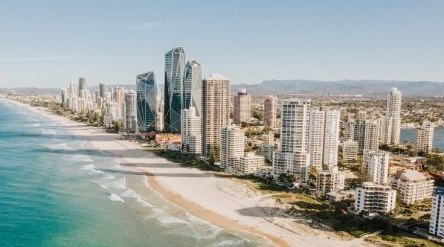
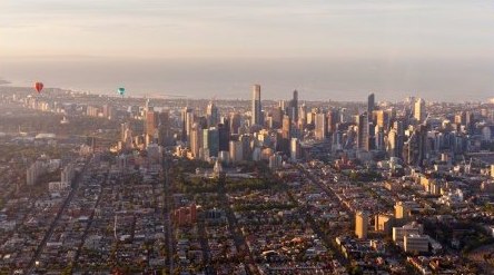
Aerial view of a city
290,000+Properties sold since 1954.
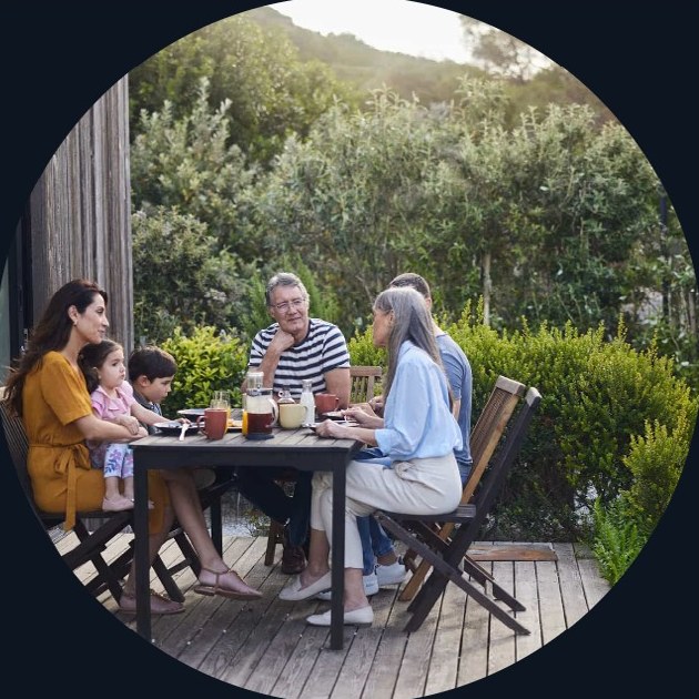
Family sharing a meal outdoors

Expressive colour combinations

Using colour pairings to guide mood and message (non-text use). To support brand consistency while allowing flexibility, we’ve created a matrix that pairs colours from the palette and defines the emotional tone each combination evokes. These pairings are designed to help content creators, designers, and marketers quickly select combinations that feel right for the message, moment, and medium.

Some feel trustworthy and grounded, perfect for investor materials or professional-facing messaging. Others feel playful, fresh, or energetic, ideal for campaigns targeting first-home buyers or social content. A few offer a more elevated, expressive, or romantic tone; suited to editorial, storytelling, or special projects.

While these combinations support expressive range, some pairings do not meet WCAG 2.1 contrast standards for text accessibility. These should be reserved for larger-scale applications, such as shapes, graphic elements, or backgrounds where contrast compliance is not required for readability.

The goal is to make colour work harder; not just as decoration, but as a strategic lever for clarity, emotion, and cohesion.

Refreshing
Tactical
Curious
Clean
Whimsical
Electric
Energetic
Edgy
Intrigue
Serene
Creative
Charged
Uplift
Vibrant
Fresh
Modern
Elegant
Tranquil
Romantic
Unexpected
04

Data Visualisation

A dedicated colour system is used for data visualisation to ensure clarity, consistency, and accessibility across all charts and graphs.

Data visualisation colour palette

While aligned with the Oliver Hume brand palette, this system is optimised for readability across digital, presentation, and print formats. Charts should feel light, refined, and easy to interpret, prioritising clarity over decoration.

Primary sequence (default use). Use colours in the following order for most charts. Colours should be applied progressively based on the number of categories. Do not select colours randomly from the palette.

Extended palette (use when required). For charts requiring more than six categories: Coral #F46665; Lime #B3F00D (highlight use only, not recommended as part of standard category sequences).

Data visualisation palette on dark background

Data visualisation palette on light background

Colour usage principles

  • Apply colours in the defined sequence and maintain consistency across related charts
  • Avoid skipping colours unless highlighting specific data points
  • Prioritise high contrast between adjacent data series
  • Avoid pairing colours from similar hue families (e.g. Coral and Maroon)
  • Ensure all elements remain clearly distinguishable at small sizes
  • Use Lime sparingly to highlight key insights or important data points

Chart styling

Line charts

  • Recommended maximum: 6 data series
  • Use slightly thicker stroke for primary data
  • Ensure clear separation between lines at all times

Bar charts

  • Maintain clear contrast between adjacent bars
  • Avoid using colours with similar brightness next to each other
  • Maintain consistent spacing and alignment for readability

Pie / donut charts

  • Recommended maximum: 6 data series
  • Order segments from largest to smallest where possible
  • Avoid placing visually similar colours next to each other
Line chartBar chartPie / donut chart
2 series
4 series
6 series
8 series

Colours are applied in sequence. All lines use the same stroke weight. Bar rows show 5 to 8 series; 7 and 8 use the extended palette (Coral, Lime). Example data only.

See these rules applied to property market charts

PowerPoint usage note

Because PowerPoint supports a maximum of six colours in a chart palette, always apply the Primary Sequence colours first. When charts contain more than six categories, PowerPoint may automatically generate additional colours. These can be inconsistent and may clash with the defined palette.

In these cases:

  • Manually apply colours from the Extended Palette (Coral and Lime)
  • Avoid using PowerPoint’s auto-generated colours
  • Ensure new colours maintain sufficient contrast with existing data series
  • If unsure, reduce the number of categories or group smaller values into “Other”.

Medium guidance

  • Ensure legibility at small sizes and across screens
  • For presentations (TV/projection), increase stroke weight by 25–50%, limit the number of data series, and avoid similar colour pairings
  • For print, avoid using Lime for small elements, maintain a minimum line weight of 0.75–1 pt, and check output for sufficient contrast

Indicator palette

For simple performance or status-based charts, a traffic light colour scale is used to indicate performance levels. Apply colours in the following order: Red → Orange → Yellow → Green.

  • Use only for status, thresholds, or performance indicators
  • Do not mix with the primary data visualisation palette in the same chart
  • Ensure labels or values support colour meaning (do not rely on colour alone)
  • Maintain sufficient contrast and clarity across all mediums

Example: status with labels

Project A
Below target
Project B
At risk
Project C
Approaching
Project D
On target

The guidelines don’t list hex values for the indicator palette. These were sampled from the colours shown in the PDF. Example data only.

05

Shape and Pattern

The brand system is built on three core shapes: circles, squares, and H Blocks. These shapes form the foundational elements for layouts, acting as containers for text, imagery, or visual highlights.

Circle
Oliver Hume “H” Block
Square

Circles

Used for focal points or accent elements, providing a soft, approachable touch.

H Blocks

Derived from the Oliver Hume logo, the H Block is composed of two rectangular forms separated by a central gap, creating a distinct, squat silhouette.

H Blocks introduce rhythm and visual interest across layouts. They typically appear as solid colour shapes; imagery may be placed within them for filler moments, but should be avoided when the focal point risks being disrupted by the central gap. In those cases, select another shape or use a solid H Block instead.

Squares

Provide structure and stability, anchoring content and establishing clear hierarchy. All text is contained within squares only; when required for composition, squares may be extended into rectangles to maintain balance.

Together, these shapes create the visual vocabulary for the brand, offering designers consistent tools for hierarchy, emphasis, and contemporary rhythm across all assets.

Download shapes and patterns (ZIP)

Dynamic modules

Arranged typically in 1–2 rows and 2–3 columns, these modules use shape variation and colour to guide attention, create rhythm, and frame key content.

When text is placed within brand shapes, it should be used on square shape only to remain consistent with the website execution. Multiple colours should also not be combined with imagery and text within the same shape treatment.

To maintain clarity and prevent visual heaviness, squares and H Blocks must always be separated by a circle. This rule ensures balanced spacing, preserves the integrity of the H Block silhouette, and prevents large geometric masses from clustering together.

Dynamic Modules are highly adaptable for both digital and print applications. They provide a flexible structure where small pieces of text or imagery can be highlighted without compromising consistency. By alternating shape type, colour, and content, these modules bring the system to life, creating engaging, contemporary compositions that reinforce the brand’s visual identity across all touchpoints.

74 yearsof expert services to the property industry.
Aerial view of a city
290,000+Properties sold since 1954.
Family sharing a meal outdoors

Do
Put text in squares only.

Do
Always separate a square and an H Block with a circle.

Don’t
Combine several colours with imagery and text in one shape.

Oliver Hume brand tile

The Brand Tile is a repeating pattern of the icon logo, arranged in a grid to create a checkerboard effect. This pattern reinforces brand recognition, introduces subtle texture, and can be used as a backdrop or accent in both digital and print applications.

Together with the Dynamic Modules, the Brand Tile completes the system of visual patterns, providing flexibility while maintaining consistency and a professional, distinctive brand identity.

Detail: the tile repeats the symbol’s circle and H Block in a checkerboard. Download the pattern from Downloads.

Bento boxes

Bento Boxes are rectangular content blocks for organising text, images, or other elements. They are modular and flexible, allowing designers to highlight key content, introduce rhythm, preserve hierarchy, and maintain visual balance.

Bento Boxes are distinct from Shape Grids and Dynamic Modules, providing clear tools for structured layouts across digital and print applications.

Structure

  • Use a 3- or 4-column grid.
  • Boxes can span 1–2 columns.
  • Maintain 3% spacing between cells for scalable, balanced layouts.

Usage

Bento Boxes are ideal for presenting images, text, or highlights in structured grids, promotional sections, or feature layouts. They scale seamlessly across digital and print applications, ensuring layouts remain clean, balanced, and visually organised while supporting a consistent brand language.

Structure: 4-column grid, 3% gap

In action

On the website, Bento Boxes sit on the 4-column grid with a 2.5em gap (40px at 1740px wide, about 2.3% of the container).

This example shows Bento Boxes in action. Boxes can be swapped, resized, or recoloured to suit different layouts and content types. They maintain visual hierarchy and balance, making them flexible for both digital and print applications while supporting a consistent brand style.

06

Imagery

In line with the brand idea, ‘Restless Achievers’, the imagery should capture the dynamism and future focus of Oliver Hume.

Our image style

Images selected must sit comfortably with the brand idea, be unexpected and sit well with the bold, modern and clean nature of the Oliver Hume identity.

Our image style is:

  • Dynamic
  • Contemporary
  • Engaging
  • Unexpected

It is not:

  • Dated
  • Cliche or contrived
  • Literal or obvious
Family cycling through a leafy park

Lifestyle

There is a flexible approach to lifestyle in order to give the stretch the brand needs across the various different business offerings. Lifestyle images should feel natural, dynamic and unexpected. They shouldn’t be clichéd or posed. For example, studio shots would not be on brand.

Coastal high-rise towers shown in black and white

Architectural

Our architectural shots reflect the premium of the brand. These shots are to have unusual perspectives, interesting and dynamic lines, and use of negative space. We use black and white photography for this category to enhance contrast and to make a clear distinction from our project buildings.

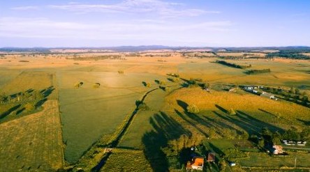
Aerial view of farmland with long shadows

Landscapes

We are looking for a more abstract take on landscapes – skies, sea, land, aerial and ground shots that present an interesting way of looking at things. These images should have a graphic treatment, using interesting lines and contours.

Abstract

Abstract images can be any form from shapes or lines to effects and perspectives. There should be a degree of dynamism and movement in our abstract imagery, and where possible, it should reflect the Oliver Hume core palette.

Father and child sharing a high five outdoors

People

Images of people should feel natural, dynamic and unexpected. They shouldn’t be clichéd or posed. For example, studio shots would not be on brand.

Photos are the PDF’s own examples. The Architectural tile shows a coastal photo converted to black and white to illustrate the treatment, and the Abstract tile uses brand shapes. The guidelines don’t include photo examples for these two categories.

On the website, people photography also includes staff and team portraits, such as team line-ups and professional headshots on the People & Careers and story pages. These can be posed but should still feel relaxed, be shot in real locations (not a studio backdrop) and use the same natural light and colour as lifestyle images.

Image examples

Imagery plays a key role in shaping the Oliver Hume brand. The photos shown here represent the tone, mood, and visual style we aim to maintain across all marketing and communications.

Use these examples as a reference point when selecting or commissioning photography to ensure visual consistency and brand integrity.

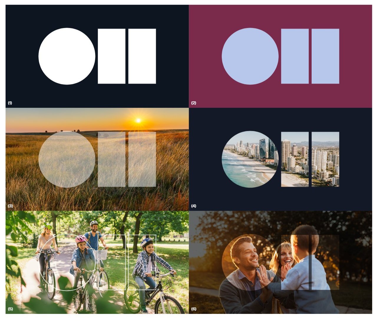
Cities, landscape and lifestyle. Circles crop photography as focal points, as set out in Shape and pattern. View the original page from the PDF.

Text over images

Background images should be selected so they do not distract from the text and must always support clear readability. A dark overlay may be applied to improve contrast when needed.

Overlay settings

  • Rich Black: C60 M60 Y40 K100
  • Blend mode: Multiply
  • Opacity: 30% - 70%
Find your place to growNo overlay: text competes with the sky
Find your place to growMultiply 30%: minimum
Find your place to growMultiply 60%: clear and readable
Find your place to growWebsite card fade: black 50% to clear

Example headline. On screen, Rich Black is shown as black with Multiply blending. On the website, full-width video and hero images use a flat 50% black overlay, and photo cards use a fade from 50% black at the bottom (from 15% of the height) to clear (at 85%), so the top of the photo stays untouched.

Photographer’s brief

Whether you’re commissioning a photo shoot, or purchasing from an image library, this template can be used as a foundation for developing a clear, concise photography brief.

Requirements and considerations

Imagery should:

  • Focus – Cluttered backgrounds look busy and make the shot less flexible to use, especially if it is to stretch across multiple uses
  • Bleed – Allow enough bleed around the composition of the shot to provide greater flexibility at the final implementation phase.
  • Cropping – Clever cropping can enhance an image and make it more interesting and unexpected.
  • Composition – Shooting in situ gives context to the subject. Be aware that people and objects can look ‘cut-out’ on white or black backgrounds (unless this is the effect you’re trying to achieve). Apparel should be timeless in style, so the image doesn’t date.
  • Consistent style/themes – Where a range of shots are being used for the same project, they should complement each other and work in harmony. Visual cues such as a common theme, cropping, composition, camera angle or depth of field can all be useful in achieving cohesion.
  • Licensing rights – Ensure that you have the legal right to reproduce the image. Royalty fees may also apply for talent, depending on the usage criteria.
  • Talent – should be comfortable and confident so they appear relaxed, and unposed. Clothing and accessories should be timeless in style and shouldn’t distract from the talent. Choose colours that contrast with the location and don’t clash with the background. Professional or non-professional talent can be used. Remember professional talent will cost more.
  • Hi-resolution – Even if the image is being used for low-resolution purposes, such as online (generally 72dpi), it’s best to shoot or buy the image at the best quality resolution possible. Always supply the Photography guidelines to your photographer or agency partner, and consult with the Marketing team if you have queries or concerns.

Lead time

With any project, it’s important to consider the role of imagery throughout the process – leaving it until late doesn’t afford enough time to make the final execution as good as it could otherwise be. Some of the considerations below should be built into your lead time:

  • Post production of images.
  • Sourcing talent.
  • Image library search.
  • Image rights or permission to reproduce.
  • Overall layout and content.
  • Print production and distribution.

Checklist

Photography should:

  • Support the proposition or objective of the overall campaign/ project.
  • Be appropriate to the audience and business segment.
  • Reflect our brand personality.
  • Align with our visual strategy and guidelines.
  • Add value to the overall execution.
  • Be appropriate
07

Applications

Here are some examples of our collateral brand design, including business cards, letterheads, envelopes, brochures, banners and more. Use these as a guide to maintain consistency and alignment with the Oliver Hume brand across all touchpoints. For applications not covered in this guide, please contact the Oliver Hume Marketing team for support and direction.

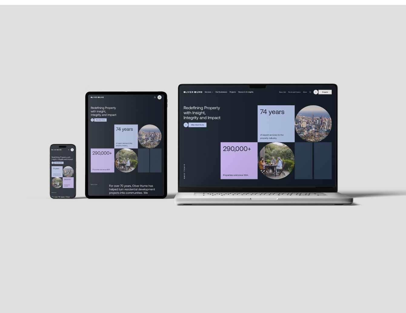
7.1Website & UI components

The website is where the new palette aligns most closely with Oliver Hume’s current visual language, offering a seamless evolution rather than a disruption. Here, colour is applied with restraint, supporting clarity, professionalism, and accessibility at every level of the user journey.

Each tone is carefully selected for contrast, readability, and functional consistency across navigation, forms, tables, and responsive layouts. This consistent application ensures visual continuity while allowing space for other channels to flex.

See the coded UI components

Oliver Hume website on phone, tablet and laptop

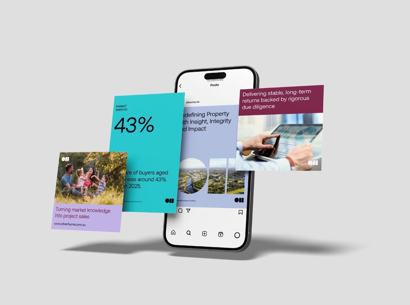
7.2Social media assets

Social is where the palette begins to stretch; inviting variation while staying anchored in the core system. This is where secondary and brighter tones can be dialled up for energy, immediacy, and platform relevance.

Use of accent colours here supports content that’s reactive, engaging, and personality-driven; perfect for campaign bursts, feature promotions, or editorial storytelling. These executions feel expressive but still recognisably Oliver Hume.

When using carousel posts, please ensure:

  • A clear narrative flow across all slides
  • Consistent use of brand colours, typography and layout
  • Readability is prioritised through concise text and strong contrast

Charts and graphs sourced externally must be high-resolution and presented on a clean white background to maintain clarity and consistency across all brand materials.

Background images should be selected so they do not distract from the text and must always support clear readability. A dark overlay may be applied to improve contrast when needed (Rich Black C60 M60 Y40 K100, Multiply, 30% - 70% opacity).

Social media posts on a phone
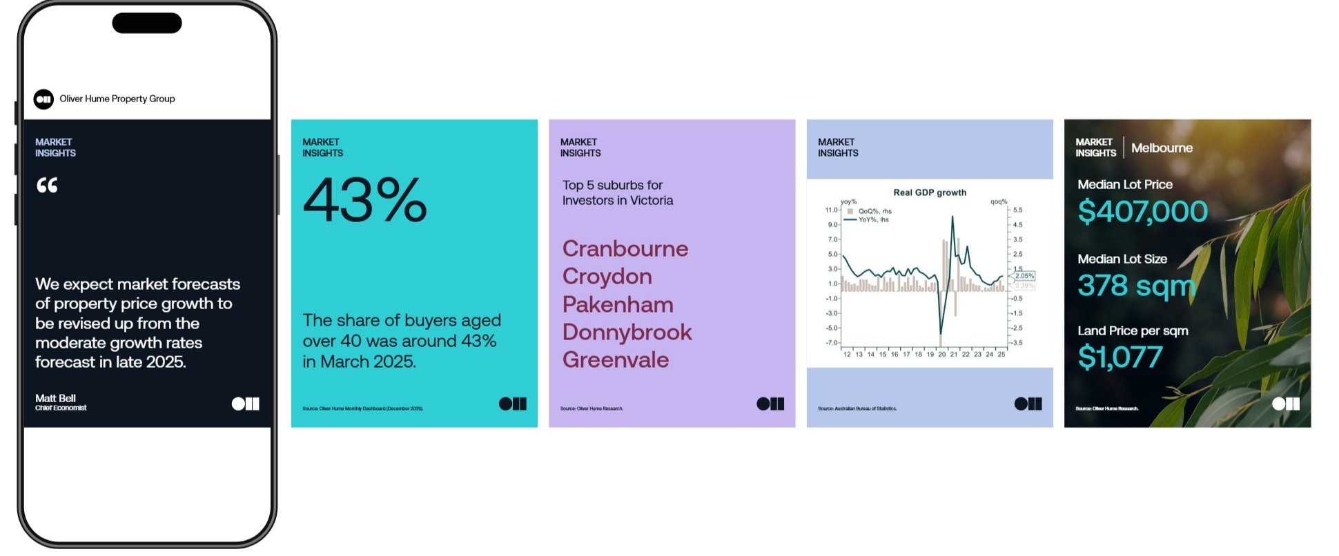
Market Insights social carousel tiles

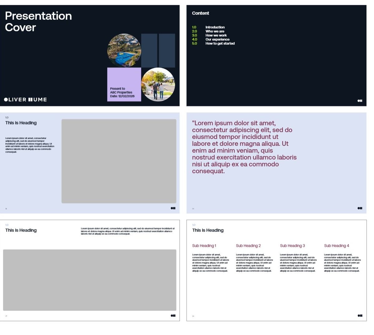
7.3PowerPoint

Our PowerPoint template includes three layout styles: Dark, Mid, and White backgrounds to suit a wide range of presentation needs and support creative flexibility. Each style offers multiple layout options featuring different column structures, text treatments, and graphic placements to accommodate various content types.

Please follow these guidelines:

  1. Fonts and colours: Brand font is embedded for you to use together with Oliver Hume brand colour palette. If the font is not working correctly, please contact Marketing team.
  2. Intro slide and cover: Always begin the presentation with the Intro Slide featuring the Oliver Hume logo. Ensure the Presentation Cover is clear, legible, and uses Small Caps for headings.
  3. Content page: Maintain a consistent layout and background colour throughout the content slides.
  4. Slide break: For presentations longer than 10 slides, insert a Section Break slide. Section Break headings must be set in Small Caps.
  5. Animation & transitions: Use animations sparingly and only when they support the message, avoid distracting transitions or unnecessary movement, and ensure any motion remains consistent throughout the deck.
PowerPoint template slides: cover, contents and content layouts

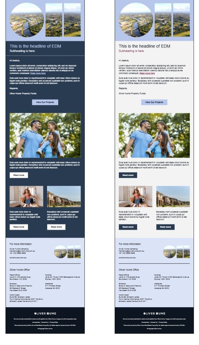
7.4EDM template

The EDM template is designed to showcase Oliver Hume communications effectively. It offers two layouts - headline on top or graphic on top to suit different messaging styles.

EDM headlines must be created as live text and not embedded within header graphics.

Backgrounds may be treated graphically or use alternative colours where appropriate to support the tone or message of the EDM.

Please follow the guideline when setting up emails, and contact the Marketing Team with any questions.

Two EDM template layouts

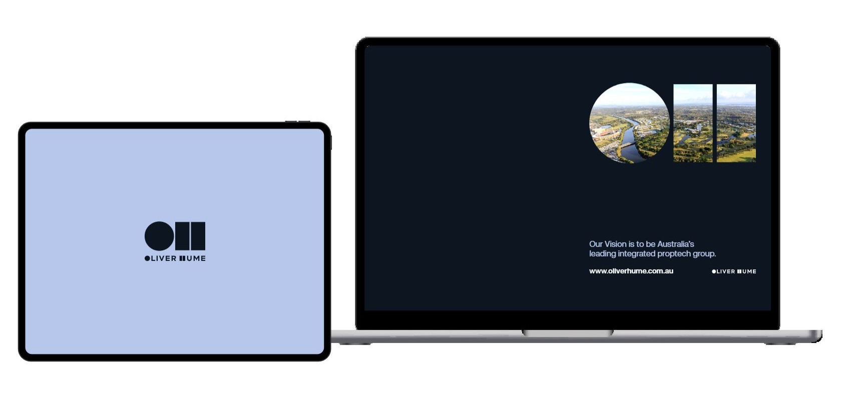
7.5Desktop and screensaver

Desktop wallpaper on a laptop and tablet

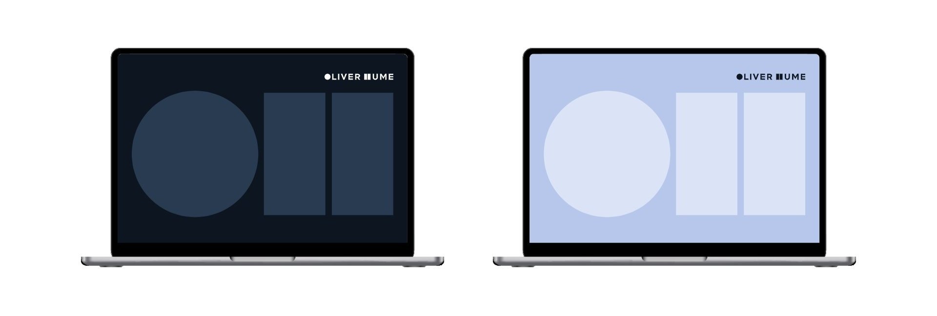
7.6Teams background

Microsoft Teams backgrounds in Midnight and Mist

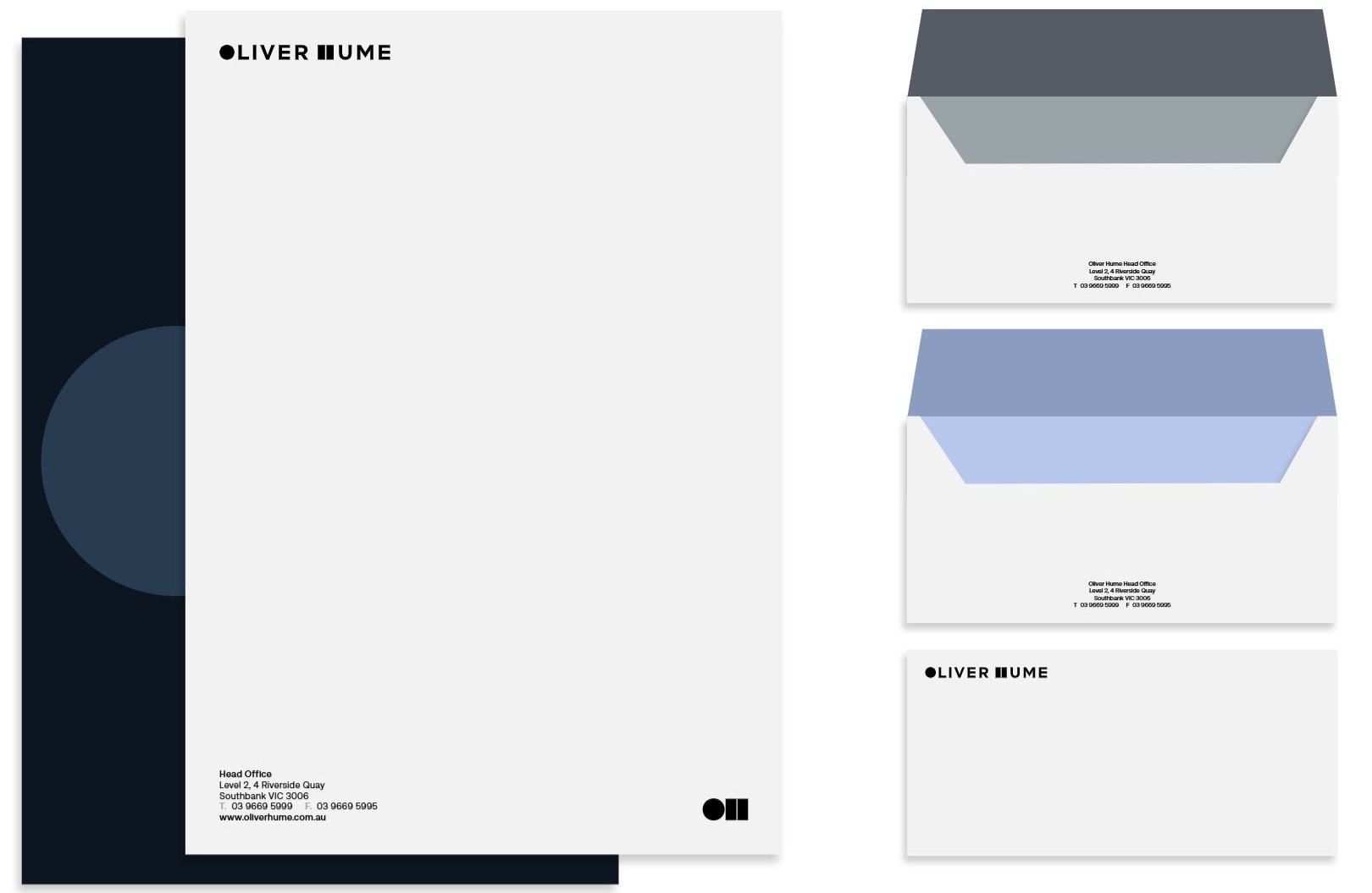
7.7Letterheads & envelope

Letterhead and envelopes

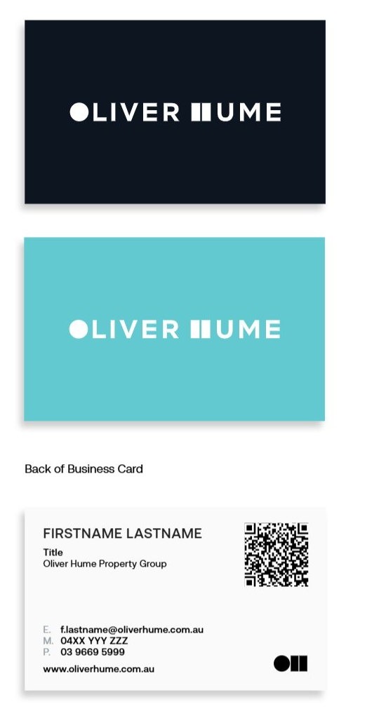
7.8Business cards

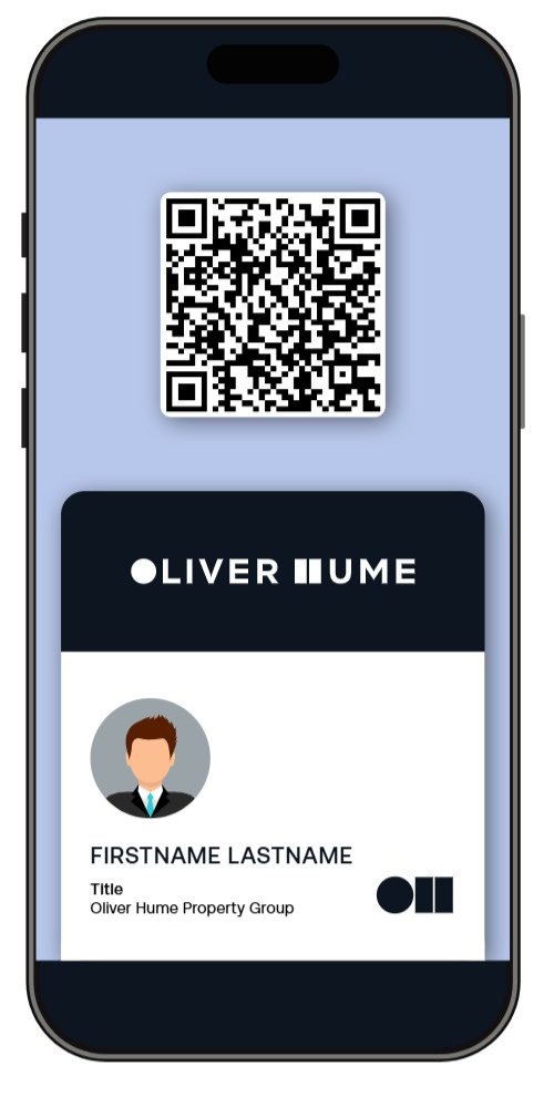
Printed business card for all staff (5 options to choose for front side), plus a digital business card.

Printed business cards: front options and back
Digital business card on a phone

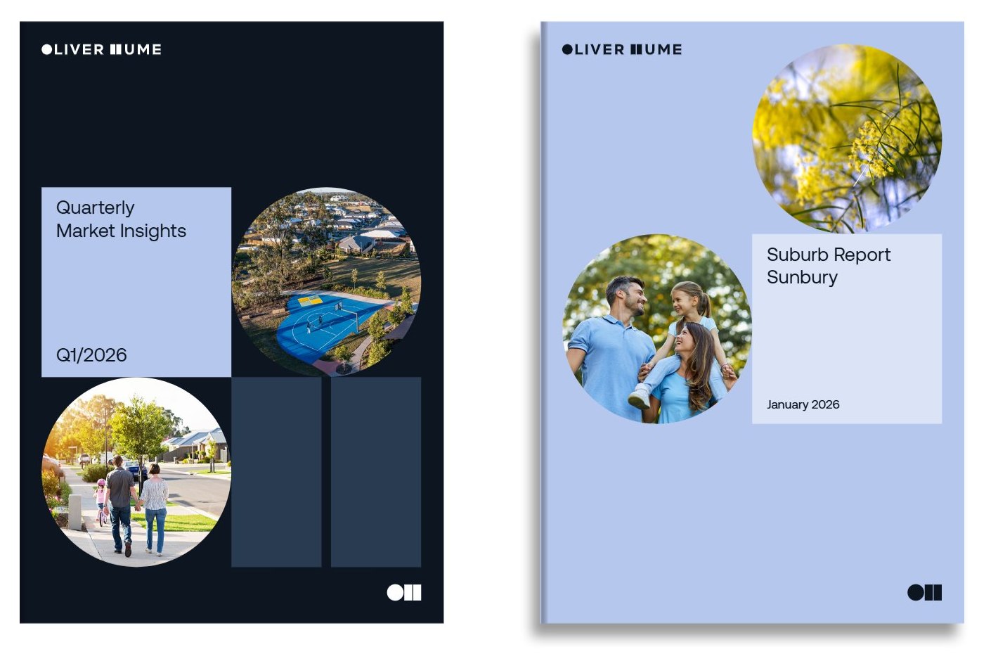
7.9Brochure

Brochure covers: Quarterly Market Insights and Suburb Report Sunbury

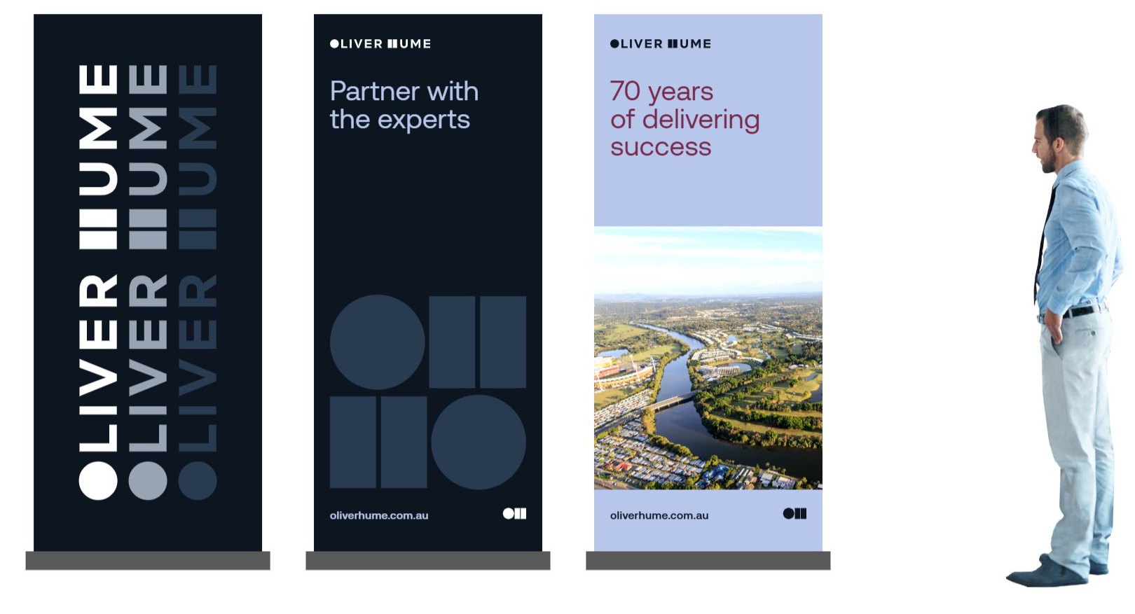
7.10Pull-up banners

Three pull-up banner designs

7.11Signage

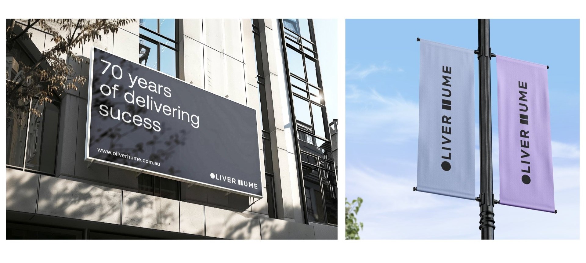
Building signage and street banners

7.12Merchandise

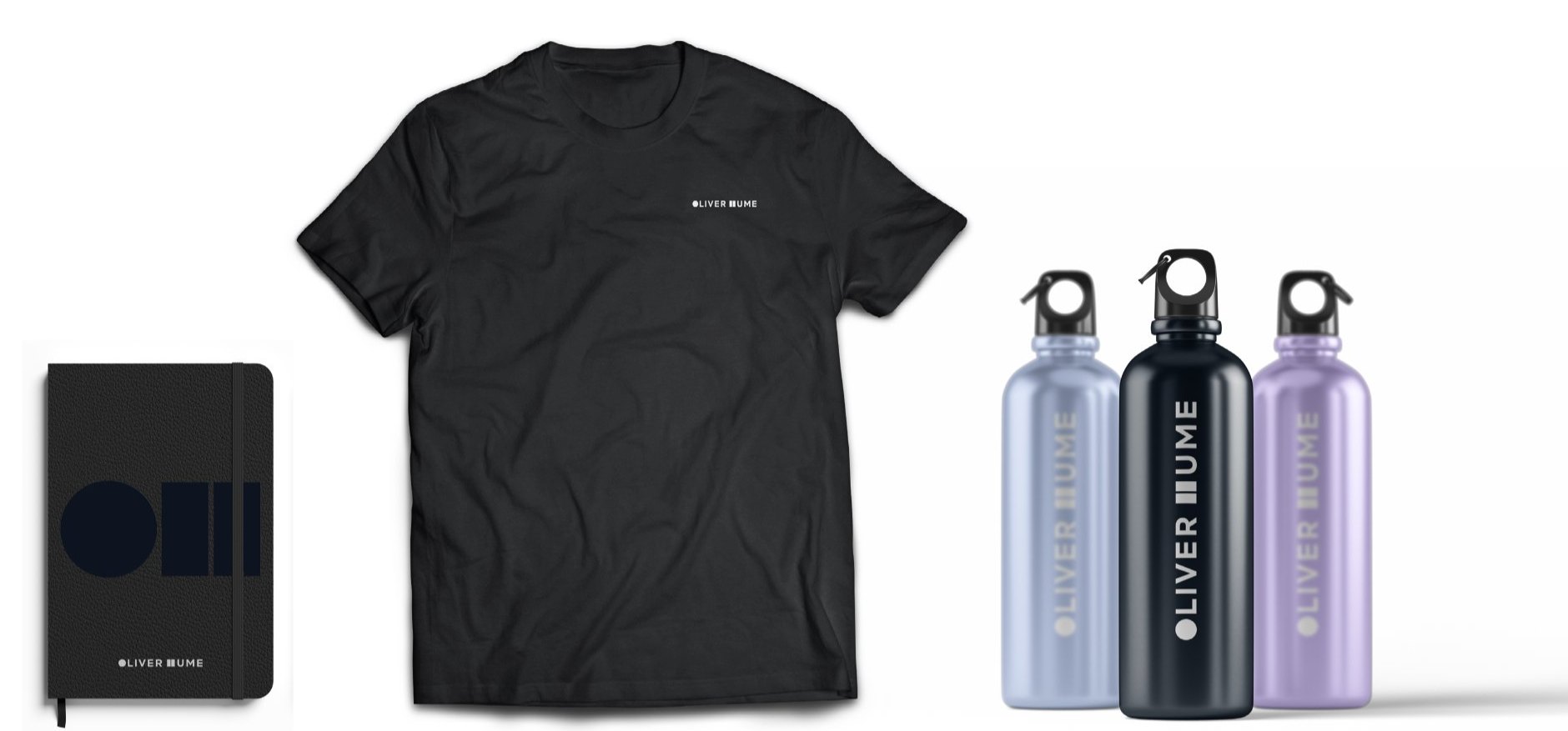
Notebook, t-shirt and drink bottles
08

UI Components

How the Oliver Hume brand behaves in websites, apps and online reports. Every component is built only from the approved colours, Aeonik and square corners, so digital products feel as considered as print.

Proposed digital extension. The Digital pages extend Brand Guidelines v2.5 and are pending approval by the Marketing team. Use them as direction, and check with Marketing before treating them as rules.

Responsive grid

As on oliverhume.com.au, layouts sit in a container up to 1740px wide with 2.5em side margins, on a 12-column grid (and a 4-column grid for cards) with 2.5em gutters. Because sizes are in em, margins and gutters scale with the screen: 40px at 1740px, about 33px at 1440px.

Sections are separated by 10em of space (160px at 1740px). See Typography on the website for how the em size changes with the screen.

Desktop · 992px and up12 columns, 2.5em gutters and margins, container max 1740px
Tablet · 768 to 991pxColumns combine into wider blocks, usually 2 across (estimated)
Mobile · under 768pxContent stacks in one column; shape modules go 2 across (480px and 768px steps)
Container
Max 1740px
Side margins
2.5em (40px at 1740)
Gutters
2.5em (40px at 1740)
Section spacing
10em (160px at 1740)
Breakpoints
1740 · 992 · 768 · 480
Grids
12-column and 4-column

Common spans

Measured from oliverhume.com.au (November 2026). Tablet column behaviour is estimated visually.

Navigation

As on oliverhume.com.au, the navigation is a fixed Midnight bar with the light logo. Main links are white Aeonik Medium, with drop-down menus for Services and Research & Insights that open as white panels with Midnight links. Smaller utility links, search and the White “Enquire” button sit on the right.

On mobile, the bar keeps the logo, search and a white circle menu button.

Top navigationFixed · Midnight
Oliver Hume
News HubPeople and CareersAboutEnquire
Drop-down menuServices
Project MarketingDevelopment SitesOliver Hume Property FundsProperty Management
Mobile barUnder 768px
Oliver Hume
Numbered tabsFeatured projects · auto-advancing
Breadcrumb and pages
Bar height
4em (64px at 1740)
Main links
Aeonik Medium 1em, white
Drop-down
White panel, Midnight Regular
Call to action
White circle button “Enquire”
Tab progress
3px white bar, rounded ends
Tap target
44 × 44px minimum

Measured from oliverhume.com.au (November 2026). A current-page marker isn’t shown on the website, so none is specified.

Buttons and links

As on oliverhume.com.au, a button is a circle holding a chevron, followed by a square label block, with a small gap between them. Both parts share one colour: Mist or White on Midnight and on photos, Midnight on light backgrounds. Form submit buttons use the label block on its own. Secondary links, such as “View All Projects”, are plain text links beside the button. A plain rectangular button (no circle) is used in other cases.

VariantsCircle + label · square label · no shadows
Why Oliver Hume Enquire Submit View ProjectView All Projects
Download report View More Circle on its own: card and list links
Rectangular buttonLabel only · no circle · used in other cases
Why Oliver Hume Download report View More

The rectangular button is a plain square-cornered label block: Mist fill with a Midnight label (or Midnight with a White label), Aeonik Medium, same 2.75em height and 1.5em side padding as the circle button. The circle + label button stays the default for website calls to action; use the rectangular button in other cases, such as tight spaces, inline in text-heavy layouts, toolbars, emails and documents, where the circle would crowd the layout.

StatesOn Midnight
DefaultHoverFocusDisabled
MistSubscribeSubscribeSubscribeSubscribe
WhiteEnquireEnquireEnquireEnquire
Height
2.75em (44px at 1740, 36px at 1440)
Circle
Same as height, chevron
Gap
0.25em
Label
Aeonik Medium 1em, 1.5em side padding
Corners
Square label, round circle
Colours
Mist · White · Midnight

Measured from oliverhume.com.au (November 2026). Hover, focus and disabled states aren’t visible on the website; the ones shown (underlined label, 2px outline, greyed out) are suggestions to confirm with the web team.

Why Oliver Hume
DoCircle and square label in one colour, with a clear label.
Click here!
Don’tUse a rounded pill, shadows, accent colours or vague labels.

Cards

As on oliverhume.com.au, cards have no borders or shadows and square corners. There are three kinds: solid-colour cards (Grey or Mist) with a heading and a circle button top right; photo cards where white text and a white circle button sit on a black fade at the bottom of the image; and news items with a small image, date, title and tags.

Corners
Square, no border or shadow
Card heading
2.5em Regular
Circle button
2.75em, White / Midnight
Photo fade
Black 50% to clear, 15% to 85%
Tags
Lime at 20%, pill, Medium 0.8em
Gap
2.5em (4-column grid)

Patterns measured from oliverhume.com.au (November 2026). Headlines are examples.

Tables

Tables are typeset, not boxed: a Midnight rule under the header, hairlines between rows and no vertical lines. Numbers are right-aligned with tabular figures so they line up. Change is shown with an arrow and a sign, never by colour alone.

Top growth corridors, MelbourneSeptember quarter 2026 · Example data
Corridor Median lot priceMedian lot size$/m²Quarterly change8-quarter trend
Wyndham$405,000392 m²$1,033+1.5%
Hume$389,500375 m²$1,039+2.1%
Melton$352,000388 m²$907−0.6%
Casey$431,000362 m²$1,191+0.9%
Source: example data for illustration. Highlighted row shows the corridor discussed in the text.
Header
Aeonik Medium 12, uppercase
Rows
48px min, hairline
Numbers
Right-aligned, tabular
Highlight
Mist 100 + Midnight marker

Forms

As on oliverhume.com.au, forms sit on Midnight. Each field is a row: the label on the left in Mist, Aeonik Bold, and the entry on the right in white with no box, with a fine line under the row. Required fields are marked with an asterisk. Checkboxes are round with a white outline, and the form ends with a label-only Mist button.

Enquiry form · on MidnightTry the fields
Enter an email address like name@example.com
Example form. Nothing is sent.
Layout
Label left, entry right, 2 columns
Label
Mist, Aeonik Bold 1em
Entry
White, no box, row about 3.3em
Row line
1px white at 15%
Checkbox
Round, 1px white
Submit
Mist label button

Measured from the contact form on oliverhume.com.au (November 2026). The website’s error styling wasn’t visible, so the error shown here (white message with an outlined marker) is a suggestion to confirm with the web team.

09

Property Data Visualisation

The chart palette applied to the charts Oliver Hume publishes most: prices, lot sizes, sales and approvals. Every example follows the colour sequence from Data visualisation and labels its units, period and source.

Anatomy of a chart

A good market chart can be understood in five seconds: the title says what happened, and the chart proves it. Each numbered part below has a rule.

1Melbourne lot prices rise for a fourth quarter

2Median lot price, quarterly, $’000

8Source: example data for illustration.

  1. Title states the insight, as a headline with no full stop.
  2. Subtitle gives the measure, unit and period.
  3. Gridlines are hairlines in Midnight 100; the baseline is Grey.
  4. Axis labels are Midnight 700, 12px, with units.
  5. Primary series is Teal at 3px; other lines are 1.75px.
  6. Label lines at their end with the latest value. Use a legend only when labels would collide.
  7. Comparison series follow the sequence: Maroon, then Lilac.
  8. Source and date sit under every chart.

Trends over time

Use line charts for change over time, with a maximum of six series. Keep each market in the same colour across a whole report: Melbourne Teal, SEQ Maroon, Adelaide Lilac. A line chart doesn’t need to start at zero, but its axis must be labelled.

SEQ overtakes Melbourne on median lot price

Median lot price by market, Q4 2023 to Q3 2026, $’000

Source: example data for illustration.

Comparisons

Bars compare values at one point in time. Sort them, start them at zero and label the values directly. On Midnight, Lime may highlight the one insight that matters most.

Mitchell offers the largest lots

Median lot size by growth corridor, Melbourne, September quarter 2026

Source: example data for illustration.

Lot sales reach a three-year high

Gross lot sales, Melbourne, quarterly

Source: example data for illustration.

Share and mix

Show parts of a whole with 100% stacked bars when comparing periods, or a donut for a single period. Order segments from largest to smallest, keep to six or fewer, and print the percentage on segments that are wide enough.

Queensland’s share of approvals keeps growing

Share of new dwelling approvals by state, %

  • VIC
  • NSW
  • QLD
  • Rest of Australia

Source: example data for illustration.

Most buyers choose 300 to 399 m²

Lots sold by size, Melbourne, September quarter 2026

Source: example data for illustration.

Tables and sparklines

When readers need exact figures, use a table. A sparkline adds the shape of the trend without a full chart; it has no axis, so always pair it with the actual numbers.

Suburb snapshotCommonly sold lots, September quarter 2026 · Example data
SuburbMedian priceLot sizeSalesQuarterly change8 quarters
Tarneit$405,000392 m²214+1.5%
Mickleham$389,500375 m²188−0.6%
Clyde North$431,000362 m²167+0.9%
Fraser Rise$358,000400 m²142+2.3%
Source: example data for illustration.

Rules for property charts

  • Start bar and column charts at zero
  • Label lines directly and keep markets in their report colours
  • Round sensibly: $398k in charts, $398,000 in tables
  • Put a source and date under every chart
  • No dual axes, 3D, gradients or shadows
  • Don’t pick colours out of sequence or use Lime for a whole series
DoBars start at zero, so differences look as big as they are.
Don’tCut the axis: Adelaide looks a fraction of SEQ when it is 73% of it.
DoUse the sequence and label each line at its end.
Don’tPick colours at random or leave lines unlabelled.

Downloads

Approved master artwork for the Oliver Hume brand. Always use these files. Never redraw, recolour or recreate them.

Asset packs

Logo set

Horizontal, stacked and symbol, in dark and light versions. SVG for design and web, PNG for Word and PowerPoint.

70+ Years logo

Midnight, Maroon and White versions, SVG and PNG.

Aa

Aeonik font

Regular, Italic, Medium, Medium Italic, Semibold and Semibold Italic (OTF). For Oliver Hume staff use only.

Shapes and brand tile

Circle, square and H Block in Midnight, Mist, Lilac and Soft Grey, plus the brand tile pattern (SVG).

Brand
Guidelines

Brand Guidelines PDF

The full Oliver Hume Brand Guidelines, version 2.5 (May 2026). 69 pages, 28 MB.

Single files
PreviewFileUse onDownload
Horizontal logo, darkLight backgroundsSVGPNG
Horizontal logo, lightMidnight and dark imagesSVGPNG
Stacked logo, darkLight backgroundsSVGPNG
Stacked logo, lightMidnight and dark imagesSVGPNG
OH Symbol, darkLight backgroundsSVGPNG
OH Symbol, lightMidnight and dark imagesSVGPNG
70+ Years, MidnightLight backgroundsSVGPNG
70+ Years, MaroonWhite and MistSVGPNG
70+ Years, WhiteMaroon and MidnightSVGPNG
70+ Years lock up, Midnight and MaroonWhiteSVG
70+ Years lock up, WhiteMaroonSVG

Need a division, partner or “Proudly Marketed by” lockup, a PowerPoint or EDM template? Contact the Marketing team at marketing@oliverhume.com.au.

Contact

Not sure if something is on brand? Ask us.

If you have any questions about the content of this guide or are unsure if your communication best represents our identity, please contact the Marketing Team at

marketing@oliverhume.com.au